Gameplay thought process and GUI Hell
Untitled Idle Mutation Game » Devlog


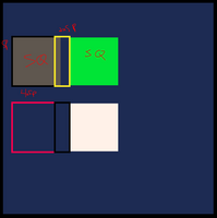
Getting started on what I want the UI to look like. Wrote a draw_rect() function to try to make my life easier, which should allow me to draw rectangles/squares based on simple criteria... clearly something is going wrong. Set generic variables in there for square (SQ) and spacing (SP) to try to simplify the uniformity and that's not going all that well, but its only day 1, sooooo.... we'll fix it.
In the meantime lets talk about what I'm trying to do here..
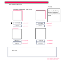
UI/Gameplay thoughts/features:
- 4 unique areas represented by icons/avatars
- Progress bars wrap around border, and fill as time (tick) increases.
- Progress until next tick update on top main bar.
- Coins/gold/points UI top right
- Info box on bottom
- Autoclick by default or click on the avatar until unlock autoclick?
- Auto click unlocked at upgrade level5/10?
- Make have a bouncing avatar in that area as well to show progress visually?
- Unlock greyed out? Show yellow bg if unlockable? Green if unlocked? Keep it simpler?
I worry there's a lot of whitespace in the bottom right. Maybe that's where the infobox goes, because there won't be a lot of room at the bottom...
Untitled Idle Mutation Game
https://itch.io/jam/ssjidle
| Status | In development |
| Author | deathsythe |
| Tags | Idle, lua, pico, PICO-8, Pixel Art |
More posts
- RELEASE!Jun 23, 2023
- Everything seems stable - now to balance betterJun 21, 2023
- This must be what Doctor Frankenstein felt like... IT LIVESJun 19, 2023
- Unlock/Upgrade functions completeJun 16, 2023
- Tearing my hair out, but this is what learning feels like, right?Jun 13, 2023
- And so it begins.Jun 12, 2023
Leave a comment
Log in with itch.io to leave a comment.